


THE CHALLENGE
How can a modern gelateria communicate decades of Italian heritage without feeling outdated or falling into the usual clichés of Italian food branding? Rocco’s is an artisanal gelateria rooted in family recipes and traditional craftsmanship. The challenge was to create an identity that could preserve this sense of nostalgia while still feeling contemporary, distinctive, and desirable.
THE APPROACH
The identity draws from the idea of a family archive — old photographs, handwritten recipes, personal notes, and memories passed down through generations. Instead of treating heritage as something static, these elements were reinterpreted through a modern visual system.


THE IDENTITY
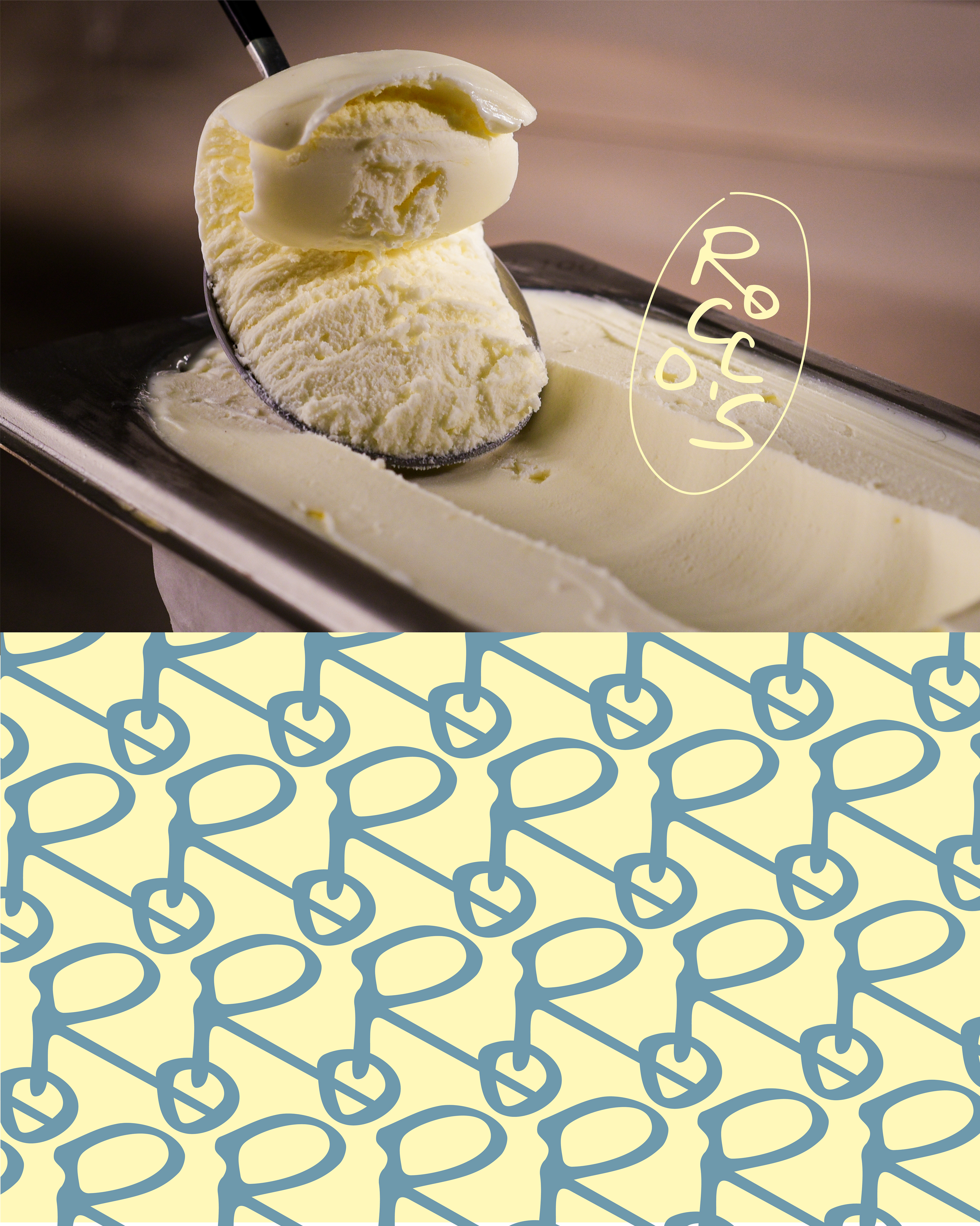
A hand-drawn wordmark gives Rocco’s a personal, imperfect quality, as if the name itself has been written and passed down through the family.
A palette creates a warm, nostalgic foundation, while bold colour blocking keeps the identity contemporary. Archival-style photography brings the family story into the brand, while a recurring handwritten pattern creates a recognisable graphic language across packaging and communication.
The system extends into tactile packaging, flavour cups, printed materials, and a transparent loyalty card designed to make the brand’s colours and identity feel physical and interactive.
THE RESULT
A contemporary gelateria identity that treats heritage not as decoration, but as something to be collected, preserved, and brought into the present.

Open for freelance and contract opportunities: masha.mittsenko@gmail.com


